An journey into Design by Analogy
Client:
Department for
Work & Pensions (DWP)
Area:
Shared Channels Experience
Role:
Senior Service Designer
The problem
Most interactions with the DWP are predicated on a basic human need for either practical or financial help, or in some cases both.
They are usually the result of a specific life event, a change in circumstance, and are rarely a conscious choice or intended journey (health, bereavement, low income etc).
People can arrive at GOV.UK having never interacted with the benefits system before, as such they can be unsure of how their own circumstances fit within the current system and more importantly, what support is potentially available to them.
The overlaps between information and support can be particularly difficult to traverse and articulate. A relatively straight forward ‘front door’ of say ‘Benefits and Support if you are disabled or have a health condition’ can lead to intersections with multiple New Style Benefits, retired Legacy Benefits and the more recent move to Universal Credit, all of which can make for a confusing landscape.
It’s a similar issue for people working within the department too, whilst you may be an expert in your own area, it is these intersections that are less easy to define and can lead to silos for both staff and citizens.
What did I do about it?
To address this, I decided I needed a common language, both visually and verbally. One that stakeholders could gather around irrespective of grade, role, or time spent within the department.
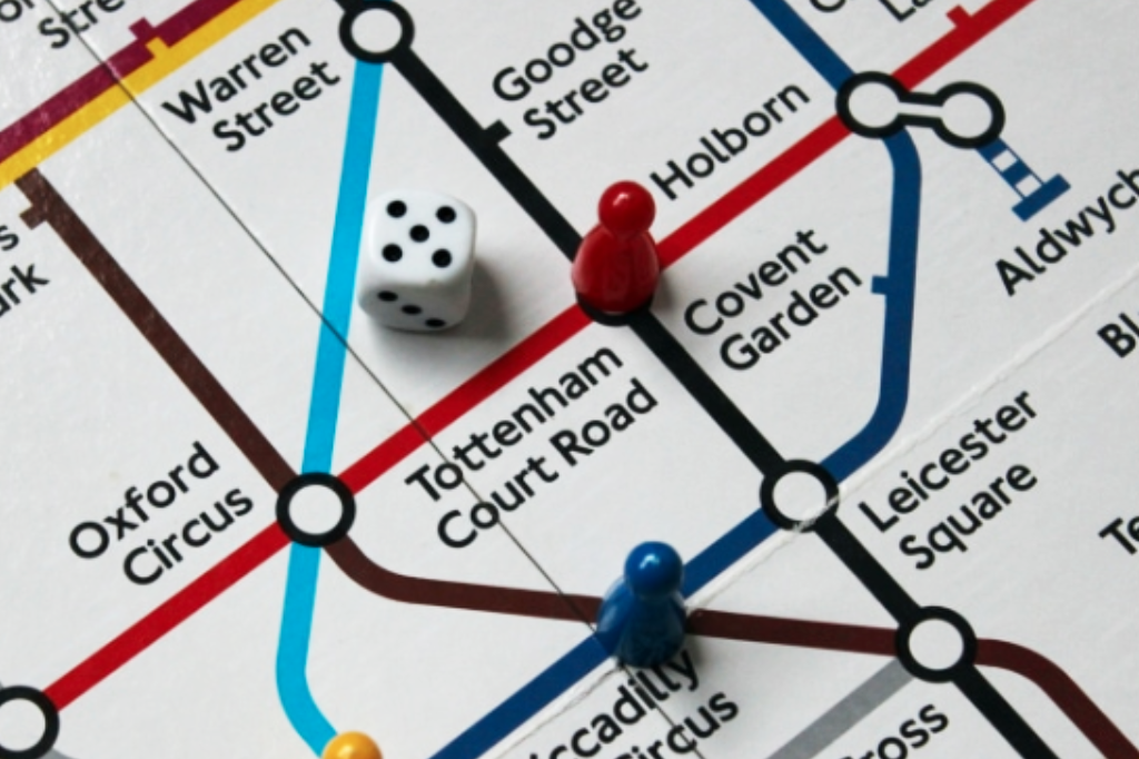
I decided on a tube map as the best way to articulate things. Afterall, it’s something that most people have experienced, it’s a global concept, and it does a great job of explaining multiple journeys under a single common language.
My first assumption was this wouldn’t be the first time somebody had thought of doing this, and a few google searches later I found a similar project in Scottish Government, which had been used to illustrate channel switching.
I also found a personal project by that article’s author Steph Krus on her blog, and an evolution of the idea into a fully fledged Miro Template by David O’Brien, also from Scot Gov.
Unfortunately that Miro ‘silver bullet’ was soon scuppered by DWP’s own switch to Mural.
An honourable mention must also go out to Metro Map Maker, which even made it past DWP’s usually impregnable firewall. But whilst a lot of these existing resources came close, they didn’t give me exactly what I needed which was
- Autonomy
- Collaboration and commenting
- Security (DWP)
As with most things, I soon realised if I wanted things a certain way, then I was going to have to create one myself.
How did I go about this?
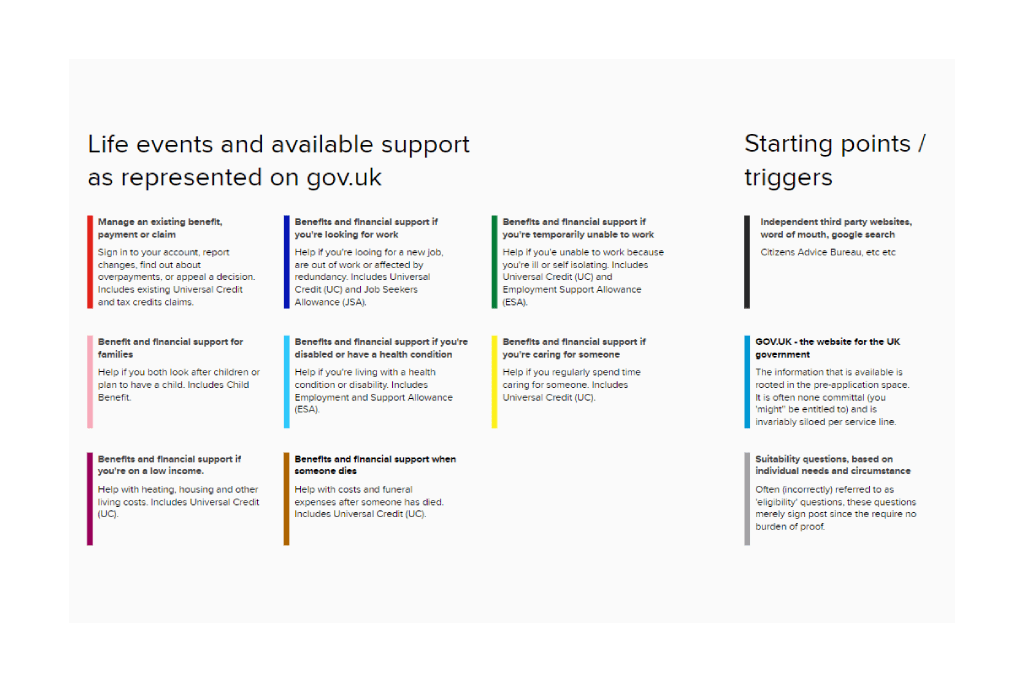
I decided to separate out each of the key life events as they were currently presented on GOV.UK:
- Existing claims
- Looking for work
- Caring for someone
- So on, and so on
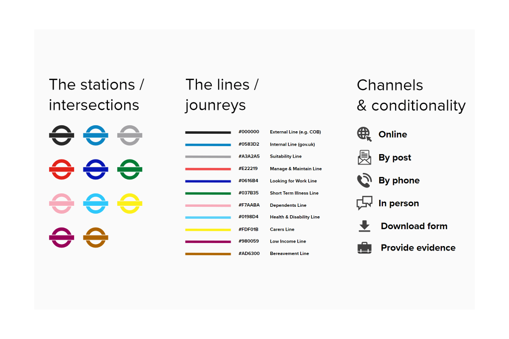
Each life event was designated a particular tube line and colour e.g. the ‘Health & Disability’ line was light blue. I also created three additional lines to show citizens entry points and how these would often be self-contained journeys in themselves.
I also wanted to illustrate the channels and conditionality at play within each route, particularly in relation to omnichannel offerings and the added friction of evidence such as ‘wet signatures’ or a ‘fit note’ for instance.
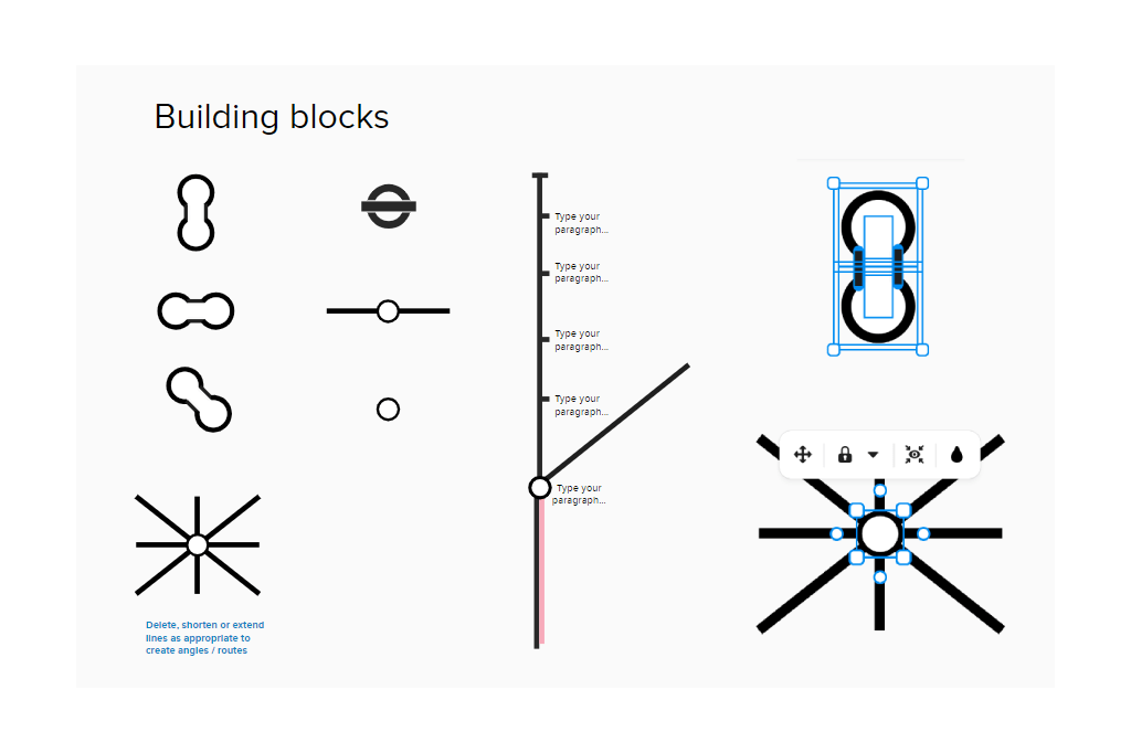
In addition to this, I also created some reusable building blocks within Mural, so that colleagues could build their own maps if they wanted to. The image below also shows how some of these blocks were constructed. Since Mural is primarily not a drawing tool, there was a fair bit of wrangling that needed to happen to achieve certain shapes, angles and connectors.
The tracks
In terms of the tube lines themselves, what I was really interested in was the intersections between the different stations. The points at which the ‘lines blurred’ so to speak (pun intended).
Where citizens were required to jump on and off a particular train, why it was necessary, and what the impact to their onward journey was.
I separated each life event into 2 main branches:
- Information & Practical Support
- Financial Support
My focus was on Financial Support, since this was the primary goal of most application journeys. I illustrated the points at which each application began, whilst also highlighting the inconsistent naming conventions used:
- Apply
- How to claim [leading to benefit specific account creation]
- Claim [benefit X]
- Make a claim
- Claim online
- Apply now
- Applying for [benefit x]
- Apply online
- Start now
Each of these application starting points was marked with a collaborative comment, which when clicked would give the following details:
- The URL of the specific application page
- Expectations from both the citizen and the business
- Opinions and answers from colleagues
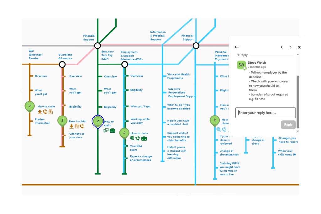
In this way, subject matter experts across a variety of disciplines (product / architecture / policy etc) were able to give explanations / guidance on the ‘as is’, whilst also contributing to any potential ‘to be’.
Creating the map was a brilliant learning experience for myself, as it forced me to consider the interplay between each benefit line and crucially the difference between suitability (sign posting) and eligibility (burden of proof).
It also allowed me to put myself directly in the shoes of a citizen. So if you’ll humour me while we stick with the tube analogy for a bit longer…
If I’ve bought a ticket for the Health and Disability line, and I’m on that journey providing data and evidence as I go.
If I then discover that I might also be eligible for Bereavement Support. Instead of just hopping on that line and reusing my ticket because its in the same ‘zone’. I’m told I need to buy a new ticket, for a new journey, and that any of the info I’ve given so far will not be valid or transferable and must be reasserted.
It is this lack of data reuse that my current team ‘DWP Apply’ is looking to address and was the main catalyst for this piece of work. Apologies for the zoomed out image below but its genuinely the only way I could fit the whole thing on a single image. Besides, the map is meant to be an interactive artefact, something groups of stakeholders can use to go on an actual journey, and experience first hand what that may entail and why.
The final output
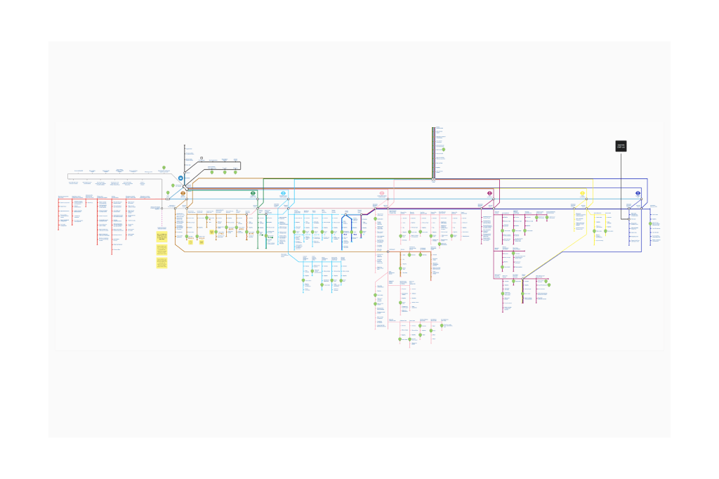
The full map in its latest incarnation.
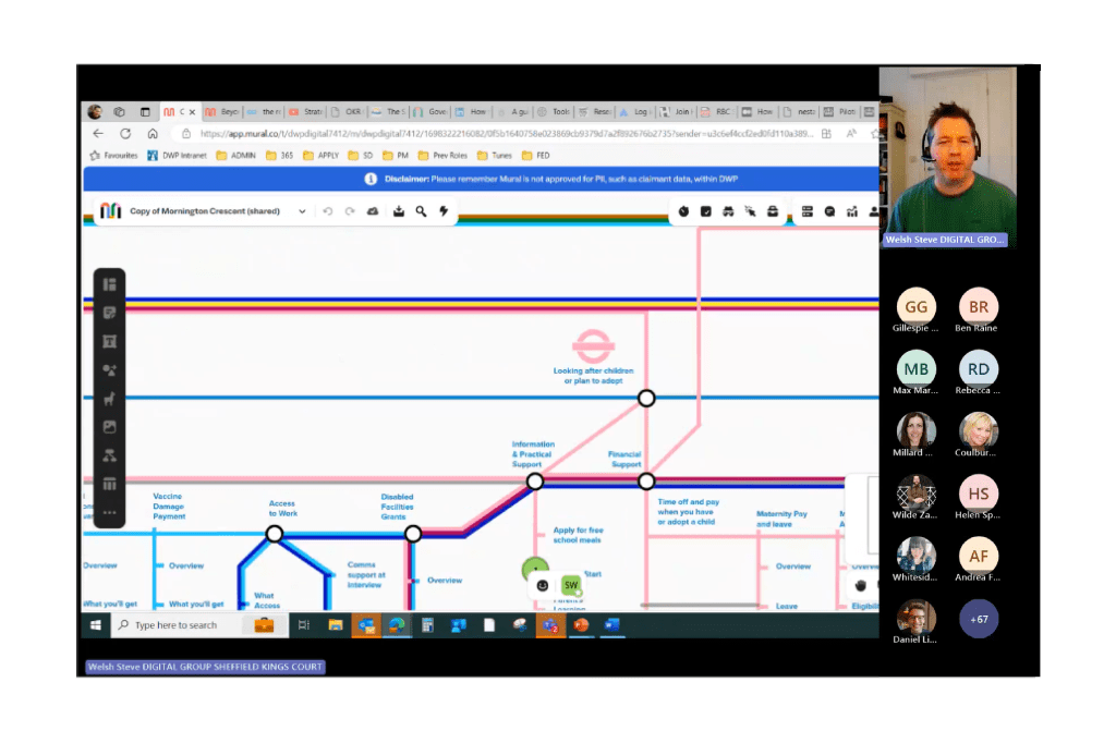
UCD forum where I presented the concept to my peers.
The Reception
“Brilliant whistle stop tour Steve, thank you! It really did go into the right level of detail – I think you pitched it just right. You, gave enough detail to make sense and pique peoples interest without going too far into the nitty gritty and losing people. Excellent!”
Senior PM – DWP
Loved your London underground analogy! I can’t imagine that came together over one night but it will hopefully make a huge difference to users! I’ve just nudged some folk in the direction of the recording.
User Researcher – DWP
I’m a new’ish interaction designer, I was on the UCD call yesterday and loved what you presented. I was wondering if you would mind sharing your London underground style map, please? I was telling my team about it and now everyone wants to see! Just looking at the map now, I cant believe you put this together! my brain would have literally exploded trying to do this its amazing!
Interaction Designer – DWP


