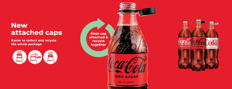
In Oct last year, Coca-Cola announced its ‘attached cap’ innovation in the UK. Now, I’ll be honest with you, this news largely passed me by.
In fact, it wasn’t until this modification was expanded to 500ml bottles (with a view to rolling out across all brands and sizes by the end of 2024), that it even appeared on my radar… or to be more accurate, passed silently beneath it.
The ‘innovation’ in question is attempting to solve a debatable problem: how to keep waste bottles and caps together to promote recycling.
While a noble cause, I’d always been brought up to squeeze the air out of a bottle, then reattach the lid to create a vacuum, solving both the lid and cap problem and reducing space in the recycling bin to allow for…. well, more recycling.
Having recently grumbled at work about a defective batch of bottles in the drinks machine, whose lids never came off properly. A colleague (who’ll remain nameless) directed me to the prominently displayed message on top of the bottle which I’d somehow managed to miss, or at least ignore.
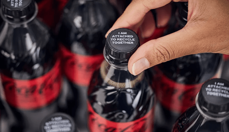
After a sheepish thank you and the deafening clang of a penny finally dropping, it got me thinking. How had I not seen this? Why had this product’s message failed so spectacularly with me?
A quick straw poll of adjacent desks confirmed I was not alone in my assumption of defective bottle cap molds, with others stepping forward like some impromptu support group.
The upshot being it led me to consider a few product / service principles that seem to have been overlooked in this release:
What is the problem you are trying to solve?
Is this ‘solution’ truly solving a problem that needs addressing? With Coke already voted worst plastic polluter four years running by the nonprofit coalition Break Free From Plastic, wouldn’t research into plastic alternatives be a better use of time, resources, and money?
User Experience / User Needs
I’m happy to be proven wrong but I can’t believe for a second that user feedback indicated this was an improvement on the previously unattached caps. In fact, I’d love to read the user research behind it (if available).
Form (should) follow function
Whilst attaching the cap to the bottle does indeed keep the two items together, it also becomes an annoying appendage that makes drinking from the bottle unnecessarily fussy.
So frustrating in fact, that most of the people I spoke to, said they ended up ripping the cap from the bottle regardless like they had always done. However, ripping the cap from the bottle has its own issues, since it leaves a serrated edge, making it uncomfortable to drink from and physically painful to screw the cap back on or off.
Good design should be silent / invisible
When ring pulls moved from ‘pull tabs’ to ‘stay-ons’ in 1989, I don’t recall a marketing campaign or explanations printed on the top of cans [citation needed].
They just worked, and for me at least, the reason they worked is because they did not impact the drinking experience (user need), but still managed to hit the business objective of reducing litter.
Okay, lets take a moment…
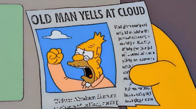
I’m conscious I’m sailing dangerously close to ‘old man yells at cloud’ territory in this article.
But it does give me a certain degree of schadenfreude when I see companies the size of Coke getting design decisions this wrong / misjudged.
I’d definitely be interested in others’ thoughts on this, particularly from a product design or comms perspective, but also from a ‘business vs user needs’ standpoint too.
In addition to this, please free to add a comment or thumbs up if you’d like to join the ‘I hadn’t realised that was an actual design decision’ support group. Our numbers are growing.


Leave a comment